
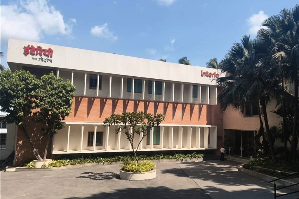
Interio by Godrej, Flagship
In 2024, Godrej Interio repositioned itself from an almirah-led legacy brand to a contemporary lifestyle brand for urban Indian homes. The Clearing defined the new identity, tone of voice and brand guidelines.
As the brand moved ahead, it faced a series of decisions on how to make the new brand guidelines hold across stores, languages, and every piece of communication people would actually encounter.
This wasn’t handed to anyone as a single brief. A lot of it accumulated, project by project, with Fish Do It.
It started with colour consistency tools for printers and signage fabricators, then vernacular signage systems, logo lockup variants, an icons library, templates for internal comms, corporate stationery, a style and visual guide for shoots and renders, and finally a full catalogue system refresh.
Signage across languages
The new Interio by Godrej logo carries internal relationships that don’t simply translate the same way across scripts. We worked with type designer Yesha Goshar to develop logo units across ten regional languages: Hindi, Marathi, Gujarati, Gurmukhi, Bengali, Assamese, Telugu, Tamil, Kannada, and Malayalam, extended across signage formats and aspect ratios for storefronts nationwide.
Imagery
We developed a working approach for photography and 3D renders. A guide on what to include, what to focus on, what to deliberately leave out. Tested on three actual shoots for the Upmods range, directing the shoot and creating renders with a fresh visual language. These became the reference point for all future campaign shoots and 3D rendering teams.
Catalogues
Interio’s catalogue system spans consumer ranges, B2B communication, trade shows, and channel partnerships. We built a flexible system that is consistent in grid, information hierarchy, tone, and cover structures, yet adaptable to different content and expression.
For hero furniture ranges like Upmods, Sync Vault, Social Office, and Workscapes, the catalogue narrative was shaped around the thinking behind the products themselves.
More on the catalogue system here
Launching Nook, a lifestyle Magazine
To help shift Interio’s perception from an almirah brand to a lifestyle brand modern Indians can actually relate to, we proposed Nook: an editorial platform, print and digital, that looks at real Indian homes with curiosity. Print copies are placed at Interio by Godrej stores, expanding gradually to cover the entire retail footprint of the brand.
Three issues in, every copy is gone within a month at the flagship stores. We’ve seen people who wouldn’t otherwise consider Interio talk about Nook on social now on their own. For a 129-year-old brand that’s reinventing itself — it’s not a small thing.
Where we are
The engagement is still ongoing. New projects, things being done for the first time keep coming in, which is often where the most interesting thinking happens. Things that look familiar but need a deep understanding of the brand’s new position, to create communication that has longevity.