
In a category where 3M is the only other brand with genuine presence, and where purchase happens by asking a shopkeeper rather than browsing a shelf, packaging had to work as an identification system, not mere decoration. That was the brief, in essence, across 18 SKUs of TruStar abrasives and Trucare painting tools.
Insight
Abrasives and painting tools are commodities. In India, they’re bought at packed hardware stores where consumers stand at a counter and ask for what they need. This is fundamentally different from developed markets where packaging is designed to be picked up, turned over, and compared across aisles of shelves. Here, the pack needs to work at a glance, from a distance, across a crowded counter.
Each pack needed a device, something a consumer could describe to a shopkeeper without knowing the product name. Here’s how that played out across the range:
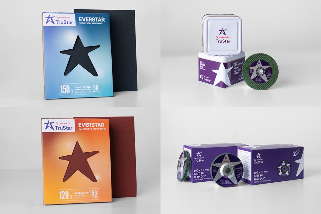
“Star wala pack”
A die-cut star on the front of the sandpaper pack through which you could see the actual paper. The star pattern repeated across the backing.
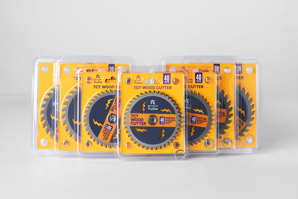
For the discs, wheels, and their monocartons and tin containers, the purple star paired with white gave the entire range a striking palette, easy for consumers to ask for and easy for shopkeepers to identify without trying too hard.
“Ice cream box wala brush”
We got the idea while grocery shopping. Ice cream sticks in paper boxes consistently sold for more than those in plastic packs. Same product, different packaging, different perceived value. That observation became the structural logic for the brush pack: a paper box that made the brush feel worth more before anyone had even used it. A system that scaled across multiple brushes and region-specific variants.
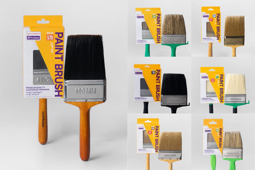
Left: Master by fishdoit, Right: Adapts by others
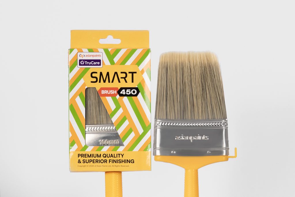
“Tiranga wala brush”
NeoBharat is a mass-market brand of latex wall paints by Asian Paints. For its brush range, we built on the same ice-cream-stick-inspired structure and took inspiration from the Indian tricolour: an intricate interweave pattern instantly recognisable to the people buying it.
“Agarbatti pack wala roller”
A tubular roller can’t go into plastic without looking cheap. Shrink wrap squeezes the roller surface out of shape, destroying the smooth finish that makes it worth buying. The hexagon was the natural answer. It gives the roller room to breathe, stacks cleanly, prints well, and is immediately distinctive against a market of plain plastic wrappers.
Dealers could also personalise R800 rollers with their shop name and choose from four colour combinations for cover, handle, and roller stripes.
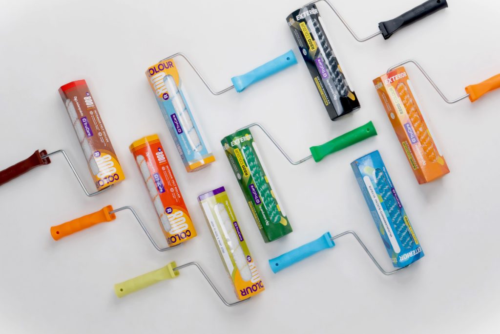
R800 Interior Masters by fishdoit. Adapts by others.
Through these 18 SKUs, we designed distinct visual languages that gave people a way to ask for what they wanted, by describing its pattern, colour, icon or design.
Role: Packaging Design, Structural Design
Duration: 2 years